Landing page optimization is the most effective technique to convert your website’s traffic into leads. Get the detailed guide on how to optimize your landing pages for better conversion. Get Landing page optimization tips, tactics,best practices & more.
Seven Boats is a top-notch landing page design company in India providing the most effective landing page development strategies to generate & capture leads. Build website landing pages, lead pages, squeeze pages, Ad landing pages, pillar pages, cornerstone pages for lead generation. The most effective landing page optimization services .
What is a landing page?
A landing page is a web page on your website that is developed specifically to convert traffic (visitor) into leads. A landing page should consist of high quality relevant content, less clutter, clear or less or no navigational links, a lead magnet (free offer, free download, trial offer) and a lead funnel (contact form or calling number connected to a CRM ).
A website can have multiple landing pages. A website’s homepage can also be a landing page. You can design multiple landing pages depending on the goal – such as homepage, ad landing page, lead page, newsletter subscription landing page etc.
What is landing page optimization?

Landing page optimization is the most effective technique to convert your website’s traffic into leads and sales. Optimized landing pages can drastically pick up your website’s performance and boost your business.
When you take all marketing measures to drive traffic to your website and visitors start pouring in from different sources, you would like to study the interests of your potential customers to meet their specific needs. The internet users are very fickle as they have every choice to click the next link and drift away from your website if they do not get the information or service they are looking from you.
Landing page optimization (LPO) and Conversion Rate Optimization (CRO) – Video Tutorial
Related reading: Website user engagement strategies & tips and how to increase your website conversion rate?
What to do for LPO? A/B Testing
Therefore, showing the same landing page to all of them from your website is not going to be a good marketing strategy here. Whether your traffic is coming from Organic or Paid search, Social Media or other sources, your ultimate goal is to convert them for profits.
Providing multiple versions of your site’s landing page with targeted content for specific type of audience is what could make all the difference here in defining whether or not a visitor converts to a customer.
The internet throws open a challenging environment for the digital marketing agencies to constantly do research through analytics and change the landing page content on an ongoing basis, so that the visitors stay loyally bound to the websites and convert to customers.
Are you not getting your landing page optimization done to convert your visitors to customers?
Then, think of us! We’re a leading Landing Page Optimization Services Agency in Kolkata, India.
What are our Landing Page Optimization Services all about?
We at Seven Boats Info-System Pvt. Ltd, through our collective experience in online marketing and content researching for our clients, have found that pre-click traffic drivers and post-click consumer experience need to be well orchestrated. That’s where our Landing Page Optimization services come into play to maximize your ROI.
Your brand’s conversion strategy might consist of a single landing page, a shopping cart, a microsite or a registration form page. Whatever the case may be, our Landing Page Optimization experts are proficient in blending creativity with hard-core number crunching.
Our team of SEO professionals, web designers, content writers, data analysts and programmers has optimized a wide variety of landing pages for our esteemed clients. A 360-degree approach that we apply to align ad-creatives and keywords with your brand’s SEM and display campaigns will definitely make the difference in providing a consistent brand experience to your visitors and maximize your conversions.
Landing Page Optimization Guide
Most of the successful landing pages we’ve designed weren’t necessarily our homepage. We were a financial education company so we generated most of our traffic and leads by publishing special one-off reports on various investing techniques and topics that had their own dedicated landing page.
However, the following are the core principles we’d use when creating such pages and I think you’ll see most of them represented on any successful (i.e. “high converting”) homepage (note: these principles weren’t invented by us…they’ve been written about and documented in many books, white papers and blogs that we’ve shamelessly copied which I’ll list at the end):
Clear Headline That Draws the Reader In –
This is probably the single most important element to any successful landing page and for some reason gets wildly ignored on many start-up homepages I’ve seen.
It was either Jakob Nielsen or someone from MECLabs that put out a study on the number of seconds a website has to grab a first-time visitor’s attention…I think it was somewhere in the 2 – 3 second range.
Bottom line, you need to have a clear, powerful and emotional headline to pull the reader through the computer screen (within their first few seconds on your page) and make them want to stick around.
When writing headlines we’d try to answer the following questions:
- What’s the primary benefit of our product/service for this reader?
- How can we write it in a way that incorporates as many of the “4 U’s” as possible? (Useful, Unique, Ultra-specific and Urgent)
Remember, “benefits” are NOT “features”. It’s important to keep that in mind while you’re writing or designing elements for your landing page.
Here’s a good way to think about it that’s always helped me:
Product: iPod 64 GB
Feature: 64 GB of Storage
Benefit: Holds 10,000 songs so you can party all night!
We’d go through multiple rounds of peer edits and ultimately A/B tests for each headline idea. It was a lot of effort, but totally worth it!
And I know it’s fun to read about how changing a button color increased click-through’s by 300%, but that’s not what commonly boosts conversions on a landing page — by far and away, the headline and initial body paragraph have given our pages more of a lift than any other variable over time.
Rule of One –
We use this concept in everything from our editorial, marketing copy and even landing page design.
The rule basically says that for any piece of content, there should be a single action you want your user to take.
Therefore, write all of your content in order to move people toward that action and design the page so that it’s as easy as possible for them to take that action.
That means, having clear copy on your button/link/email submission form.
It means making sure the button, the copy, etc. are large and bold enough to draw the user’s eye.
And it really means that you shouldn’t have multiple calls-to-action on your landing page.
The worst thing you could do is make someone THINK!
It’ll make them question what they’re even doing on your site, it’ll make them second guess the purchasing decision they were about to make, etc.
Designing for the “Rule of One” eliminates all of that indecision, stress and anxiety for your users.
Reduce Friction –
This principle speaks to some of the concepts I discussed in point #2 but it’s worth breaking out on its own.
In addition to making sure you have legible fonts, your call-to-action is above the fold, etc., reducing friction also means getting inside your user’s head.
It means understanding the things that will typically hold someone back from downloading your app, signing up for your email list or purchasing your product. What questions or concerns will typically come to their mind?
- Do I really need this? or, Is this product any good?
- What else is out there?
- Who else is using this?
- Are these guys a real company?
- What are they doing to do with my email address?
- Will they steal my credit card?
Thinking about all of these concerns will allow you to design a page that helps speak to each of them in an efficient and concise way.
For instance, when it comes to questions like, “Do I really need this?” or “Is this product any good?”, showing testimonials or endorsements from respected 3rd parties is always a good way to boost conversions.
And for “trust” related questions, showing security seals, SPAM policies, credentials from the management team, etc. all work towards reducing anxiety in the mind of the user.
Use attractive lead magnets
You can use free offer, discount coupon, free PDF book download, Trial offers etc with strong catchy title with power words as lead magnet, so that people share their contact details quickly with you.
Use Urgency or Scarcity
Keep things in a way it looks like really important and if anyone does not do it now, they will miss a good opportunity. You should create a solid sales page.
Summary
If you break out the three principles above I think you’ll see that they all come down to the following simple equation:
Motivation – Friction = Probability of Conversion
Your goals should be to:
1. Increase Motivation
2. Decrease Friction
Top 3 Tips on landing page design

This is the classic case of knowing the hand of your opponent in a card game! When you know exactly what to expect, you can prepare for the occasion and also minimize the chances of disappointing either yourself or the person you are dealing with. For most website designers, knowing the usability preferences of the users is next to uncovering a goldmine! With that kind of insight into the user’s psyche, the website designing is bound to be visually appealing and easy to use. Here are the top 3 tips on how people look at websites:
Conventions Matters
There is little wisdom in driving down the wrong side of the road just to be different or to get noticed by making a point. You will only end up causing greater damage than you can anticipate. Website designers follow certain conventions that you find common on all the major websites of the internet. While we encourage you to think differently and, to borrow a cliché, out of the box, you should not tinker with the accepted norms of the website designing fraternity in trying to strike out as ‘different’.
Cut the Clutter
Websites that look cluttered are a cause of repulsion among website users. Online users are usually hard-pressed for time, handling many web browser tabs at the same time. You cannot give them a garbled web page where they can locate nothing and where they cannot claw back once they move ahead by clicking on one of the links. Segregating data on the basis of areas so that users can quickly locate what they are looking for is one website designing tip that is not always amply stressed upon.
Clicks More Visible
Amid all that writing you have got going on your website, there makes no reason why your clickable links should be like little clues strewn through the wilderness. Make it obvious and visible for your users to click on web links where you embed them on the web page. Try to state the obvious in this department, leaving no room for ambiguity. Remember that web users don’t like riddles thrown at them! Just focus on getting them what they want quickly.
A sample landing page analysis below –
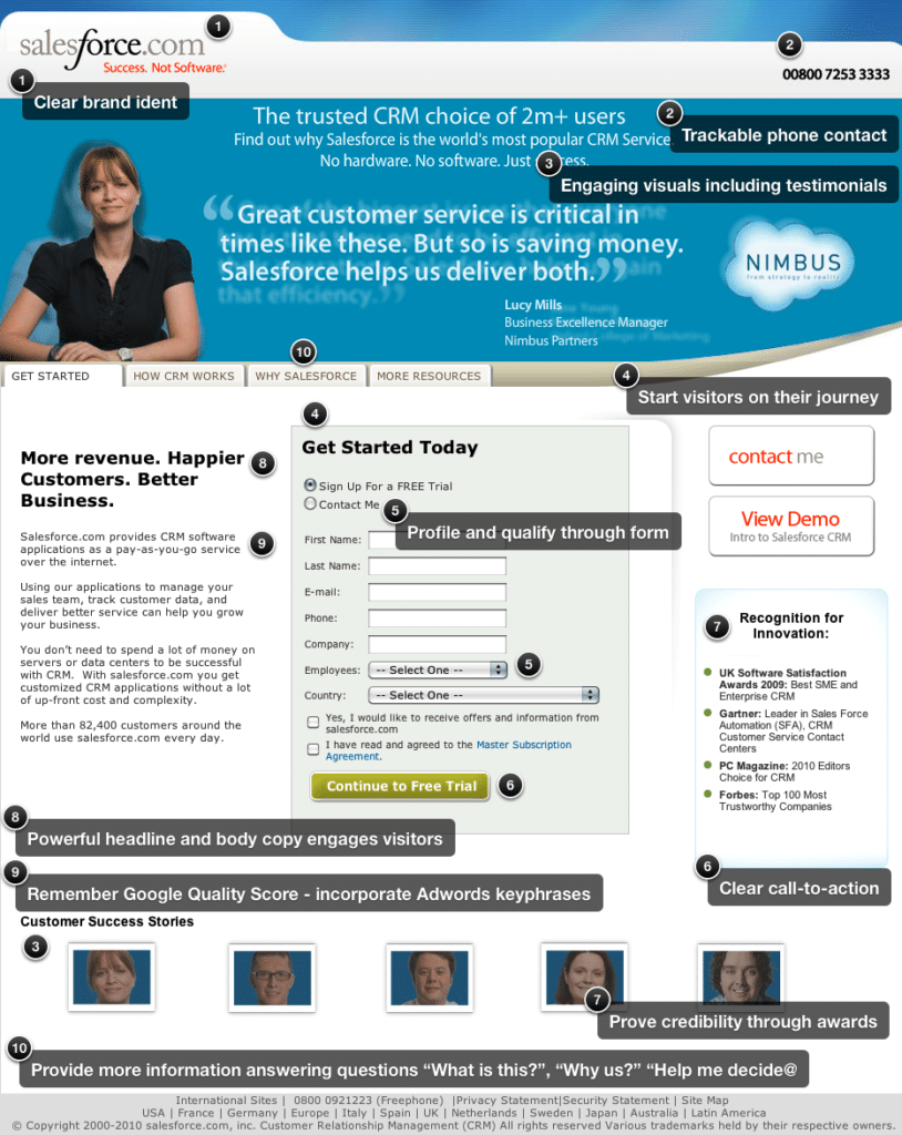
Contact us for your FREE audit today and assess your Landing Page Optimization requirements.
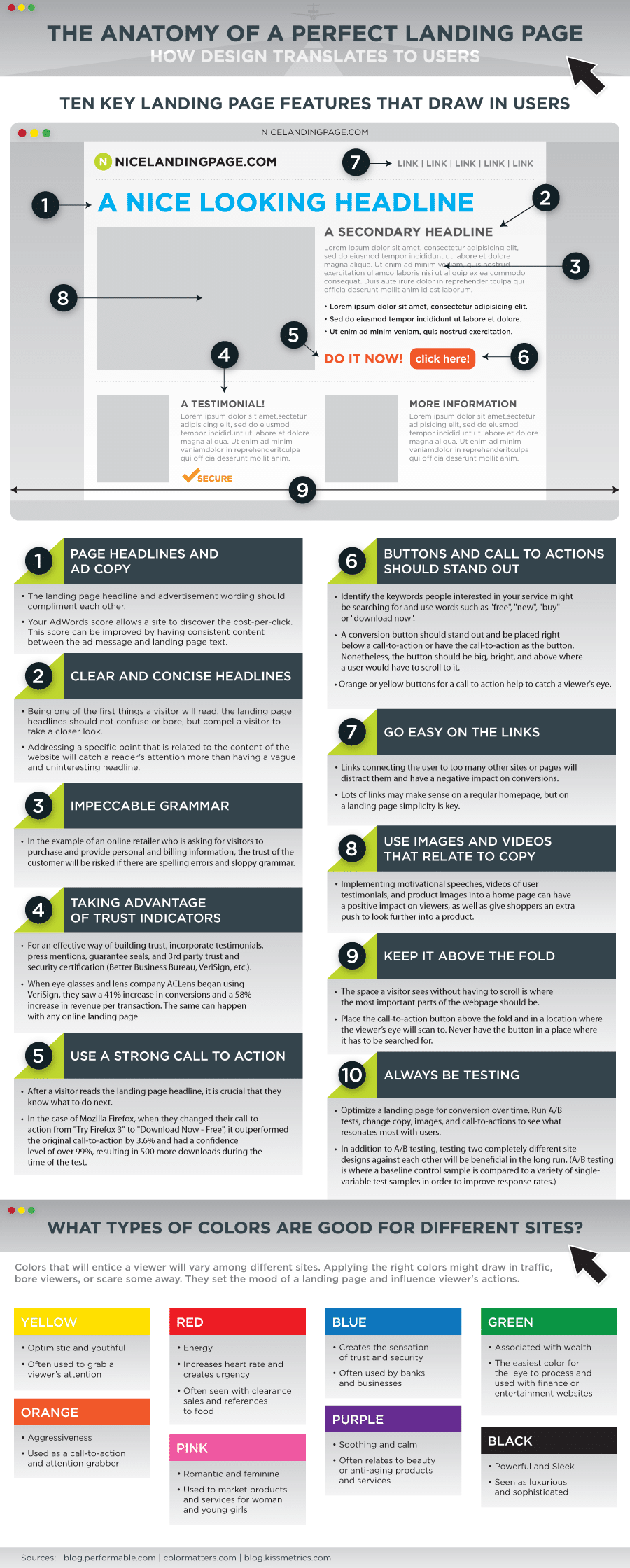
Anatomy of a perfect landing page
Video Tutorial on How to Optimize Landing Pages
SEO steps for every landing page
On-page SEO for landing pages
- Decide landing page.
- Do content research for target audience
- Create landing page with researched informative content
- Target each landing page with 3-4 proper long tail keywords meaningful for the page
- Decide 1 unique focus keyword for the page
- Write proper title tag with focus keyword
- Write meaningful meta description using focus keyword & 2-3 terms from your target keywords
- Insert image & write image alt text using focus & related keywords
- Do keyword blending in body content keeping density not more than 3% for long tail keywords
- Do contextual internal linking with keyword rich anchor text
Offpage SEO for landing pages
- Increase popularity of your target page by backlinking or mentioning from popular, relevant, good quality 3rd party webpages
- Do competitor analysis to shortlist good quality 3rd party websites & backlink your landing page from those sites or similar sites (free or paid)
- Use proper keyword in anchor text from 3rd party websites while backlinking your webpage
- Maintain natural link profile while backlinking
- Bring backlinks to home & internal pages of your website
- Improve social signal by sharing your webpage from social media platforms
- Bring links randomly & naturally from multiple location & devices
Top 3 Tips for Landing Pages that Convert
landing pages need to be stellar; regardless of your overall website design. As such, it’s important that your landing page uses a form that inspires customer to fill up.
As one of the first pages that your potential customer sees, your landing pages need to be stellar; regardless of your overall website design. As such, it’s important that your landing page uses a form that inspires customers to continue through your site and make a conversion.
However, it’s not as easy as it sounds. While best practices are helpful, it’s important to focus on how YOUR customers convert. Here are three tips on how you can optimize your landing page for exactly that.
Know Your Obstacles, and Avoid Them
When setting up your landing page, you should have a relatively clear understanding of how browsers view it. Knowing what makes your current landing pages effective and what pages are seeing a high bounce rate is the only way of knowing how to begin.
- Load your page using a variety of different browsers to see how your content formatting looks. You can use any one of the free “browser shots” websites.
- Taking too long to load is one of the first mistakes you can make when creating a landing page. Your landing page load time should not exceed five seconds; this is bad for customer experience and SEO. Check the speed of your site using Google’s speed tool.
- Whatever changes you make to your landing page, be sure to test their effectiveness fairly regularly. One way to do this is by creating matching pages with specific differences and measuring which ones are most effective.
Balance Your White Space
Don’t be afraid of using white space on your landing page. In fact, blank space might end up being your best friend when designing a page that increases conversions. Experts at Unbounce.com suggest, “The purpose is to use simple special positioning to allow your Call To Action (CTA) to stand out from its surroundings and give your eye only one thing to focus on.” But, be sure you aren’t over-using this technique.
- Be sure you don’t eliminate too much information that the viewer no longer knows where he or she is. As long as you include a company logo and necessary basic information, you shouldn’t have to include much other text. As with most things, it’s important to achieve a balance.
Set a Clear Path
When leading potential customers towards a purchase, it’s important that you are clear in you CTA. Customers should be aware of exactly where they should click to sign up for your services, and what exactly your services can do for them. Having a clear message for your customer is one of the most important things you can do to improve conversion rates.
- Be sure they are aware of what they are going to receive when asking for their personal information.
- The customer’s feeling of security is of upmost importance. Be sure to include a well-placed company logo and your contact information at the bottom of the page to reassure them of your legitimacy.
- Make buttons stand out by using a contrasting colors or aesthetically pleasing design (studies show that orange can be an effective color). Be sure not to make your graphics too cheesy or exaggerated – consumers want real.
Like designing your website, there are many tips and tricks for optimizing your landing page to increase your customer conversions. Whether you outsource the work or do it yourself, knowing what your customers want and how you can best optimize for that will be your best shot at improving landing pages and increasing conversion rates.
Top 5 Landing Page Optimization Tips
To ensure that you get more conversions out of your landing page, check if you qualify on these Top 5 landing page tips mentioned here in this post.

Landing pages have a core function to perform in the online sales cycle. This is the make or break point of the process. You have the attention of the potential customer, the person is on your territory with a willingness to learn more and this is the stage where you simply can’t go wrong! Unfortunately, most do! To ensure that you get more conversions out of your landing page, check if you qualify on these Top 5 landing page tips:
- Headings and Content: There must be a complete match with the headings, the headline tags and title tags that you are using with the content that you have dished out. If the headlines point to a different stance of the content, your reader will lose interest. You have little time to grab their attention. Do not keep any discrepancy between headlines and content.
- Query and Content: Users come to the landing page because they have generated a query, more probably in a search engine box. They have clicked and come to your landing page. You must ensure that your content on the landing page matches their query. For example, if they have come to your landing page with the query ‘How to Make Tea’, your content must tell them how to make tea and nothing else.
- Above the Fold Factor: The user must find what they are looking for above the fold, that is, before they scroll down. The landing page should give them what they came for before they have to scroll down. If they have to do so, their interest will flag down and you will lose your purpose. Keep things simple and at the very top of the landing page.
- Sharing the Page: Users like to share what they find as interesting. This serves your goal of reaching out to a wider network of online users. So, you must facilitate this process of sharing by offering share buttons for Facebook and Twitter, if not the other social media networks.
- Track and Test: Do not rest on your laurels when you are working on landing pages. Always keep tracking and testing for results, even when the conversion rate is satisfying you. You never know when they start slipping away. Regular tests will stem the rot the moment it sets in.
Better Landing Page Images for Better Conversion

The images on your online landing pages can be a make or break opportunity for you. Landing page images can tell a thousand stories, we have this being repeated so many times. But when it comes to landing pages, web designers go berserk with the images! Sometimes there are too many images cluttering the landing page, sometimes the image is too complicated to unfold any story or interest the viewer, while at other times the image looks great but does not seem to have a link with your marketing message! You need to address these issues while picking the right image for your landing pages.
Clutter Free
Images cease to make an impression on the viewer if there are too many of them on the landing page jostling for attention. It is a kind of cannibalism that you can avoid easily! Use lesser but more impactful images. Your idea is to ensure that the image lingers on in the mind of the user even after they have closed down the tab. Too much emphasis is no emphasis at all – keep this motto in mind while selecting images for your landing page.
Meaning and Relevance
Your landing page is for online lead generation and sales, not an exhibition gallery! Your images on the landing page must convey your marketing idea across and not just sit pretty as a mere visual. Select images that complement your brand or marketing mantra. Choose a less appealing image that is more meaningful and relevant than one that looks great but does little to speak for your brand. Use images craftily and it might hook the viewer more than your catch line.
Beyond the Box
The internet is a cluttered space. There are so many landing pages that viewers come across on an average surfing session. How do they remember your landing page among all of these? Your image has a big role to play here. Think of images that are not clichés in the online space. Thinking laterally and bringing in images not overexposed in your domain of business can do the trick for you. Go creative but within certain constraints! Your image must be unique and different but not completely unintelligible. If you can strike that sweet mean spot in the balance, your landing page will be a screamer for online viewers.
How to Optimize The Landing Page for a Better Conversion
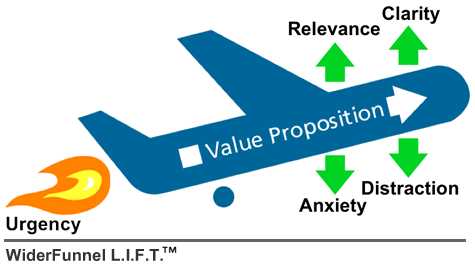
Learn how to optimize landing page for better conversion. Know the The LIFT Model: The Six Landing Page Conversion Rate Factors developed by Chris Goward.
The landing pages were first introduced as pages to attract people and then take to a particular page. However, the modern day landing pages are more advanced in terms of flexibility and actions. The landing page optimization is a great way to make the landing pages more effective and attract more traffic with it.
You can now use the landing pages as full one page websites to make sure that you can control the visitor even better way. The optimization techniques will allow you to make the visitors take actions that you want them to take.
There was a time when people used to use many number of keywords to get the top spot in the search engine result pages. It used to work well for the websites till the introduction of the modern day search engine optimization algorithms.
It started to filter the contents that had too much keyword. The landing pages become a great solution for that. The landing pages are the best medium for connecting your website with people.
The landing pages attract people and bring to your site. Even if the SEO strategies fail, the landing pages will do the job for the websites. It’s important to create them in a way so that it can bring the visitors exactly where you want them to.
One thing that you need to understand is that people think about themselves first and that’s why you have to be the website that will fulfill their needs. Communicating with your visitors is very important and the landing pages are your main communication tool.
You need to make sure that the landing page is attractive enough to grab someone’s attention and make them to visit your website. The title of the landing page should talk about your business and your personality.
Understand what the visitors are looking for and make sure that your landing page answers them properly. The actions of the landing page should appear clear so that people can easily use the page to reach particular sections of your website.
Grabbing the visitor’s attention with an attractive and meaningful image is very important in order to make them click the desired actions. Another small trick that you can use in your landing page is using words that create a personal connection between you and them. “YOU” is one word that will make individual visitors feel that you are personal with them.
The LIFT Model: The Six Landing Page Conversion Rate Factors (Landing Page Influence Function for Tests™ (or LIFT™) Model, a framework Chris Goward developed for WiderFunnel to use to analyze conversion pages and develop test hypotheses)
Source: WiderFunnel
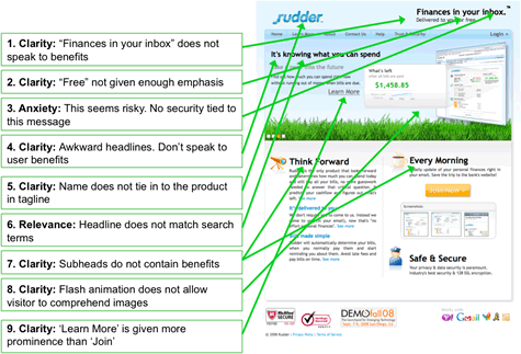
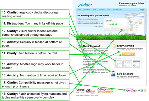
Guide to increase your landing page conversion rate
How to optimize landing page
- Understand your campaign goals.
- Write simple and straightforward headlines.
- Craft a compelling flow of text.
- Use the right images.
- Employ CTAs (Call to Action) that make users take action.
- Highlight the value proposition. Keep YOU approach.
- Increase page load speed.
- Optimize your form fields.
- Do A/B testing
Related reading: How to increase conversion rate and 7 Tips for writing an engaging call-to-action (CTA)
Generating Lead from Landing Page
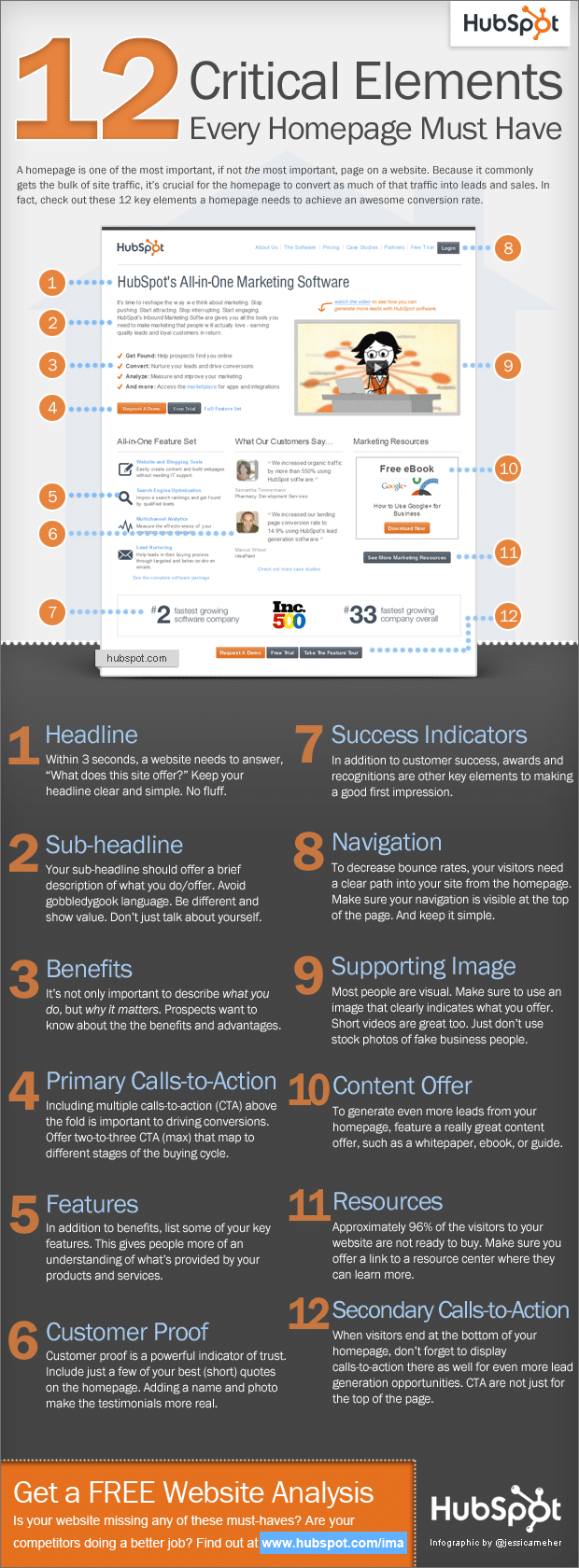
Learn how to use landing pages to generate leads. Tips & tricks to generate lead from landing page. Infographics – 12 elements every landing page must have.
Landing pages help you to make a good first impression, and you have only one chance to do it. In fact, landing pages have the potential to get you a lead or sale. And generating leads are a must for growing your business. Thus, constructing and optimizing a landing page is essential for achieving quality leads. Remember your first impression is the last impression, when it comes to generating leads through landing pages.
Thus, make sure you have an effective punch line that can motivate the visitors’ purchasing decision. Also, double-check your web design and check for page errors, especially the 404 errors. Broken link is something your landing page cannot afford at any cost.
Likewise, check the loading time of your landing page, the images (if any) must not take too much time to load. In addition, your content should be optimized properly. Place the images and call to action buttons strategically to retain your customer’s attention. Your focus should be on creating an urge for them to buy your products/ services.
Optimize the punch line carefully as well as focus on the color scheme and design of the page. Overall, your landing page should be user-friendly. Never try to yell at your visitors, forcing them to buy your products. Too much of bold letters and larger font-size won’t help you to generate leads, rather it will annoy the visitors and they are likely to leave the page without exploring your page/ website further.
Another way to generate leads through landing pages is by optimizing data gathering forms. Having information about your visitors will also help you in future lead generations. For example, if you know what other (of course related) kind of products and services interest the visitor, you can contact them in future with such services and make direct sales.
However, don’t bother your visitors with loads of extraneous questions; rather, try to get most relevant data while allowing them to switch fields with tab. Also, providing auto fill facility will help visitors to give information with ease. Another important factor you need to consider while optimizing data gathering forms is its position. Make sure you place it at a prominent position. Pop-up forms can be a good idea to catch visitors’ attention; however, they can be annoying at times.
In conclusion, keep your landing page concise. Focus on the call to action buttons to grab the attention of the visitors. Limit on the quantity of content and optimize the page according to the folds. All your important points should be placed above the fold. However, don’t neglect below the fold altogether. You never know, placing a call to action button there as well may do the magic for you.
Related reading: How to generate lead online?
12 Elements every Landing page should have – Infographic
Source: Hubspot
Related reading: Evergreen web design trends & tips to follow
Landing Pages to Match Social Media Campaigns
A weak landing page undoes all the hard work you do in social media campaigns. Social media campaigns are carried out to create an interest among online users and potential customers about your brand. When they feel interested, they check out your website by clicking on social media web links.
They are directed to a landing page. If this landing page is not good enough for these online visitors, your entire cycle goes for a toss. Here are some pointers to keep in mind while devising landing pages that complement your social media campaigns.
The landing pages, before all, must be consistent with the appeal of the social media profiles, both in terms of content and visual designs. Interested visitors will feel repelled by landing pages that are completely different in appeal from what they have encountered in your social media pages.
Remember that these visitors check out your social media pages and then come through to the landing pages. Your message on the landing page and the visual appeal must be consistent. A casual, youth oriented social media page should never lead to a landing page that will impress only hardcore corporate guys!
The social media platform you are tapping into has a huge say in what kind of landing page you are setting up. For example, if your landing page is receiving traffic from websites like Instagram or Pinterest, written texts will not suit your purpose.
Here are visitors who like pictures and Infographics more than pages of text. This choice is clear from the fact that they hang out on social media networks that cater to users passionate about pictures and visual aids. Use landing pages that are high on these elements instead of one that contains articles or traditional blog posts.
Most online users tap into social media stream while they are on the go. They tweet or update their profiles while doing things like buying groceries or waiting in queues. They are also clicking on your landing page links in such situations.
Create landing pages that consider this fact! Mobile device users will not appreciate being redirected to landing pages suitable for desktop or laptop users. Attune your landing pages according to this pressing need. Offer information that mobile users will feel interested about when they are moving around. This will be beneficial for your business.
Associated Online Marketing Services
- Web Development Services
- Web Design Services
- SEO Services
- Social Media Marketing Services
- PPC Services
- Content Writing Services
- Digital Marketing Services
Learn digital marketing. Seven Boats Academy offers online digital marketing training course, digital marketing training course in Kolkata & digital marketing workshop for students, professionals & entrepreneurs/organizations.


