Intro
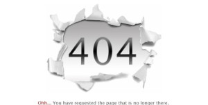
The 404 error page is an old enemy of everyone with a website! No matter how many precautions you take and how good your back-end operations are, there is every chance of 404 pages showing up. There is inevitably that broken link lurking somewhere that gives away your hard work for a pittance. The smart way out is not to worry yourself sick over 404 error pages repelling your online visitors away. A much wiser move would be to design your 404 error page in a way that is not negative but forthright.
How to make your 404 page better? Let’s find out.
3 Cool tips to spice up your 404 page
Admitting your error is the best way to take the sting off the repercussions of your mistake. Why not approach 404 error pages in a positive light? Write something creative that is both honest and humorous. When the user finds something worth reading on your 404 error page, the brunt of the problem will not hit so hard. Assure your visitors that all is well beneath the 404 error page and redirect them to some other web page.
A call to action is important on the 404 error page to divert the attention of the user away from what is staring back at them from their computer screens. Get them some useful navigational route to something that is engaging and interesting. Your visitors will appreciate the diversion and also desist from backing away. 404 error pages will stop being the terminating point of the visitor’s interaction with your website.
Another way to work out your 404 error page is to make it appealing in terms of the web designing. Add a dash of color and you will find it interesting how the attitude toward this rather irritating roadblock for your online visitors changes drastically. It will be easier for you to bring down the bounce rate resulting out of these 404 error pages.
The aim of brushing up your 404 error pages is to ensure that users are not leaving your website because of this technical glitch. You have to bring out some benefit from this otherwise ugly scenario.
5 Best Tips to make your 404 page better
To make a 404 page better, consider the following tips:
- Clear and concise message: Clearly state that the requested page is not found to avoid confusion. Use friendly language and provide suggestions for what the user can do next.
- Branding and design consistency: Ensure that the 404 page reflects your website’s branding and design to maintain a cohesive user experience.
- Navigation and search options: Include a search bar or provide links to popular pages or relevant content to help users find what they’re looking for.
- Error reporting: Provide an option for users to report the broken link or error they encountered, allowing you to fix it and improve the user experience.
- Engaging visuals and humor: Consider using engaging visuals or injecting some humor into the 404 page to lighten the situation and keep users engaged.
By implementing these tips, you can enhance the user experience on your 404 page and increase the chances of retaining users who encounter errors.
Examples of funny messages on 404 error page
Sure! Here are some examples of funny messages on 404 pages by various brands:
- Lego: “Oops! Looks like this page stepped on a Lego. Sorry about that!”
- GitHub: “There’s no code like 404, but don’t worry, we’ll find it together!”
- Mailchimp: “You’ve wandered into the jungle. Looks like this page is swinging from tree to tree.”
- Bluegg: “404 – This page doesn’t exist. Like the tears of our interns when they can’t find the coffee machine.”
- Dogstudio: “Woof! You’ve dug up a page that doesn’t exist. Time to go fetch another one!”
- Wistia: “Oops! This video must have gone on vacation. It’s currently sipping margaritas on a beach somewhere.”
- CSS-Tricks: “404 – Page not found. Don’t worry, even the best developers get lost sometimes.”
- Bitly: “Looks like this link has been bitten by a vampire. It disappeared into thin air!”
Remember, these examples showcase the creativity and humor that brands have used on their 404 pages to engage users in a light-hearted manner.


0 Comments